In a common sense, a recession is associated with gray economic times with a weakening of the economy as a whole. If the recession lasts for a longer period of time, experts refer to it as a depression.
For 2020, for example, a severe recession was recorded simultaneously for a number of countries as a result of the corona crisis. In the US, the price-adjusted gross domestic product declined by 3.5 % compared to 2019. Air travel, tourism and hospitality suffered massive losses from large-scale lockdown policies.
The current macroeconomic forecasts show that the risk of a recession is substantial. At the moment, global macroeconomic forecasts do not look good, with the Ukraine war, high energy prices, looming soft commodities shortages, etc….
So we spent quite a bit of time setting up a model in R that gives us an indication of an impending recession. Typically, markets detect a recession 3 to 6 months before it officially occurs. So we want to achieve an indication that gives us up to 12 months’ notice of a recession.
1 Retrieving time-series from data base
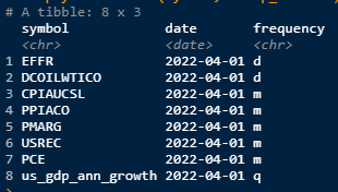
First, of course, we need a history of suitable economic time series that is as long as possible. We want to model the USREC history and the key requirement is to get the best possible data points with a high relevance. We will use the following time series because we can assume that each of these points should have a reasonable impact on the economy as a whole:
10yr - 2yr Yield Spread: Positive values may imply future growth, negative values may imply economic downturns10yr - 3m Yield Spread: alone a simple recession indicatorEFFR: Effective Federal Funds RatePCE: Personal Consumption Expendituresus_gdp_ann_growth: GDP Annual Growth RatePPIACO: Producer Price IndexCPIAUCSL: Cunsumer Price IndexPMARG: Producer Margin as CPI - PPIDCOILWTICO: Crude Oil as current Level of Energy costs
Theoretically, we can use as many time series as we want, but we have to be careful that time series do not become redundant and we do not overfit the model.
If we discover in the course of the forecasting process that our time series contain statistical errors, we can always start over and adjust the input data. since one of the major pitfalls is: Garbage in - Garbage out!
# Connect to aikia DB
mydb <- connect_to_DB()

# retrieving raw data
eco_data_raw <- DBI::dbGetQuery(mydb, "SELECT symbol, price, date
                                       FROM fin_data.eco_fred_raw_data
                                       WHERE symbol IN ('T10Y2Y', 'T10Y3M', 'PCE',
                                                    'us_gdp_ann_growth',
                                                    'EFFR', 'PPIACO','CPIAUCSL',
                                                    'DCOILWTICO','PMARG','USREC');") %>%
  dplyr::as_tibble() %>%
  dplyr::mutate(price = ifelse(symbol == 'USREC',ifelse(price == 1, 100, 0),price), # scale the recession height for plotting purposes
                date = lubridate::as_date(date))

# check for frequencies of time series
eco_data_freq <- DBI::dbGetQuery(mydb, "SELECT series, name, frequency
                                   FROM fin_data.eco_ts_meta_data") %>%
  dplyr::as_tibble()


DBI::dbDisconnect(mydb)
2 Key Data Preparation
2.1 Unification of Time Series
After we have unified the time series in order to align the basis for our calculations as neatly as possible, the historical data collectively start in the beginning of 1974.
We have to consider that we do not have a lot of data points to train our Machine Learning (ML) model. Furthermore, we need to divide the history that is available into a training phase to learn the target structure and a testing phase to verify our models. The last recorded recession in the U.S. occurred at the corona crisis in 2020. Therefore, we divide the historical period into the training phase 1974-2012 and the testing phase 2012-2022. This means, with the current setup we have 38 quarters available for the training phase.
Although we want to keep the approach fairly simple for this illustrative purpose, we see that all time series are available on at least a monthly basis, with the exception of the GDP time series. If we now interpolate the GDP series, we could get from 38 to a total of 456 data points. The gain of the interpolation outweighs the disadvantage of the interpolation uncertainty, since the trend in the respective quarters of the GDP development remains intact.
Frequency Comparison of Time-Series
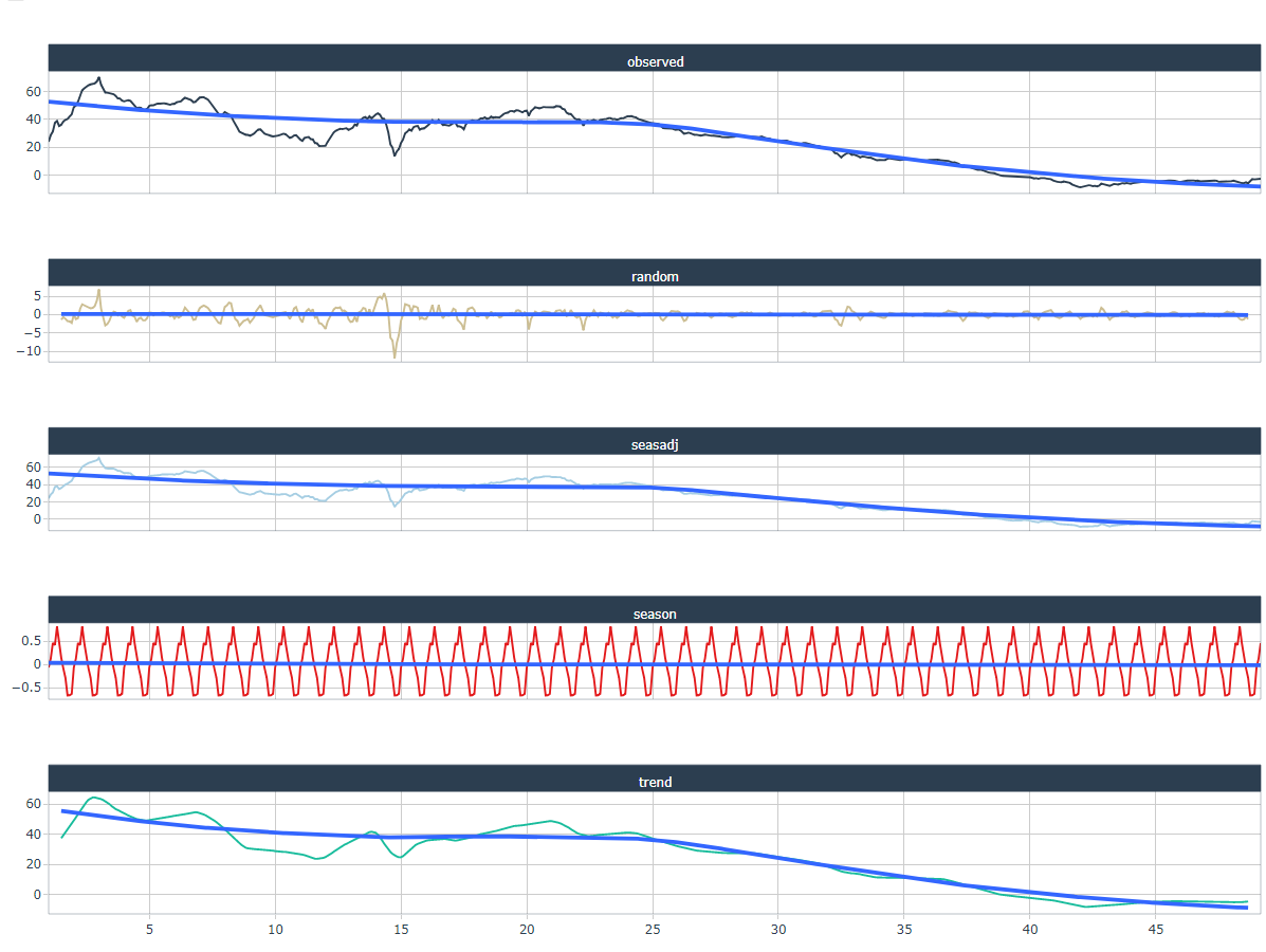
2.2 Check for Sesonality
Time series data can have a variety of patterns, and it is often helpful to divide a time series into several components, each representing an underlying pattern category.
Here, it should be noted that the decomposition includes a trend component, a seasonal component, and a residual component. In the case of strongly trending data, the seasonally adjusted data should show much more
fluctuations than the residual component. Therefore
Var(Residual)/Var(Trend + Residual)
should be relatively small.
However, for data with little or no trend, the two variances should be approximately equal.
A good reference to ‘Measuring strength of trend and seasonality’ can be found at the link.
s_plot <- list()
# check for seanonality
for(i in 1:length(unique(eco_data$symbol))){

 s_plot[[i]] <- eval(substitute(
   eco_data %>%
    dplyr::filter(symbol == unique(eco_data$symbol)[i]) %>%
    dplyr::select(price) %>%
    stats::ts(frequency = dplyr::case_when(
                  eco_data_freq[eco_data_freq$series == unique(eco_data$symbol)[i],"frequency"] == "d" ~ 250,
                  eco_data_freq[eco_data_freq$series == unique(eco_data$symbol)[i],"frequency"] == "m" ~ 12,
                  eco_data_freq[eco_data_freq$series == unique(eco_data$symbol)[i],"frequency"] == "q" ~ 4,
                  TRUE ~ 12)
    ) %>%
    stats::decompose() %>%
    sweep::sw_tidy_decomp() %>%
    tidyr::pivot_longer(-index, names_to = 'name', values_to = 'value') %>%
    dplyr::group_by(name) %>%
    timetk::plot_time_series(
        .date_var = index,
        .value = value,
        .facet_vars = c(name), # Group by these columns
        .color_var = name,
        .interactive = TRUE,
        .legend_show = FALSE,
        .title = eco_data_freq[eco_data_freq$series == unique(eco_data$symbol)[i],"name"]
    ), list(i = i)))
}

# print plots
s_plot[[1]]
Here, we use the STL method, which is a robust decomposition of time series. STL is an acronym for Seasonal and Trend decomposition using Loess, while Loess is a method for estimating nonlinear relationships. The STL method was developed by R. B. Cleveland, Cleveland, McRae, & Terpenning (1990).
3 Train a Machine Learning model to fit the US Recession Indicator
Here we use the great h2p package that automates this process as much as possible. AutoML is a function for training a wide range of ML models on our dataset. This includes tuning the model, which helps us explain the basics of the model and later use it for our target investigation.
3.1 Initializing the h2o Environment
library(h2o)
h2o.init(max_mem_size = "16G")
3.2 Data Extension
Before we start, we want to enrich our basic data points with some arithmetic modifications and provide some legging periods to get an indication of temporal inconsistencies. In the best case, we get information about leading data points that help us to get a time lead in detecting an upcoming recession.
If not yet included in the time series, we create
- yoy in % terms
- mom in % terms
- mom in abs terms
- cumulative sums over 3m for Producer Margins
- rolling PnL over 3m for Energy Costs
We also providing lagging periods for all indicators
We want to train a classification model because the cardinality of the US recession column to be determined is equal to two, i.e., it is either 0 or 1. Therefore, the USREC response column must be converted to a categorical column before training the models.
eco_data_prep <- suppressWarnings(eco_data %>%
  tidyr::pivot_wider(names_from = 'symbol',
                     values_from = 'price') %>%
  dplyr::arrange(date) %>% # as q,m,d frequency ts are included some columns include NA's
  tidyr::fill(EFFR,DCOILWTICO, .direction = "updown") %>% # fill the daily gaps to avoid NAs at month's end
  dplyr::filter(date == lubridate::floor_date(date, 'month')) %>%
  tidyr::drop_na(USREC) %>%
  dplyr::mutate(dplyr::across(.cols = c('PCE','PPIACO','CPIAUCSL'),
                              .fns = ~(./dplyr::lag(.,n = 12)-1),
                              .names = "{col}_YoY_chg"),
                # MoM % Change
                dplyr::across(.cols = c('us_gdp_ann_growth','EFFR','DCOILWTICO'),
                              .fns = ~(. / dplyr::lag(.,n = 1)-1),
                              .names = "{col}_MoM_chg"),
                # MoM abs Change
                dplyr::across(.cols = c('us_gdp_ann_growth','EFFR','DCOILWTICO'),
                              .fns = list(~(.x - dplyr::lag(.,n = 1)),
                                          ~(.x - dplyr::lag(.,n = 2))),
                              .names = "{col}_MoM_abs_{fn}"),
                # 3mth cumsum
                dplyr::across(.cols = c('PMARG'),
                              .fns = ~(.x + dplyr::lag(.x,n = 1) + dplyr::lag(.x,n = 2))/3,
                              .names = "{col}_3m_mean"),
                # 3mth cumsum
                dplyr::across(.cols = c('DCOILWTICO'),
                              .fns = ~log(.x / dplyr::lag(.x,n = 2)),
                              .names = "{col}_3m_chg"),
                # lag everything
                dplyr::across(.cols = is.numeric,
                              .fns = list(~dplyr::lag(., n = 1),
                                          ~dplyr::lag(., n = 2),
                                          ~dplyr::lag(., n = 3),
                                          ~dplyr::lag(., n = 4)),
                              .names = "{col}_lag_{fn}"),
                USREC = as.factor(USREC)) %>% # Categorization of USREC
  dplyr::select(-dplyr::contains("USREC_"), -PCE) %>%
  tidyr::drop_na())
3.3 Training ML Models
After the time series modifications, we divide the history into two periods. The longer period we use as a training session and with the shorter period, which includes the last recorded US recession of 2020, we test the trained algorithms.
Finally, we use the Automatic Machine Learning (AutoML) method from the H2O package, which connects us to an automated training process for supervised machine learning models. AutoML finds the best model for a training frame and a target variable, and returns an H2OAutoML object containing a ranked list of all models trained in that process, ranked by a standard model performance metric.
recession_train <- eco_data_prep %>%
  dplyr::filter(date <= "2010-01-01")


recession_test <- eco_data_prep %>%
  dplyr::filter(date > "2010-01-01")


h2_train <- h2o::as.h2o(recession_train)
h2_test <- h2o::as.h2o(recession_test)


autoML <- h2o::h2o.automl(training_frame = h2_train,
                     x = setdiff(names(h2_train),c("USREC","date")),
                     y = "USREC",
                     nfolds = 5,
                     max_runtime_secs = 90*5,
                     verbosity = "warn")
3.3.1 Comparing Learning Phase to Testing Phase
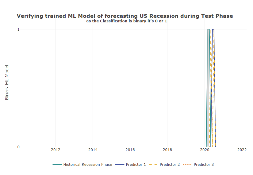
After we have trained different ML algorithms on our training data, we can visually display the two periods and check the results.
h2_test$pred_autoML <- h2o::h2o.predict(autoML@leader, h2_test)$predict
h2_test$top2 <- h2o::h2o.predict(h2o::h2o.getModel(autoML@leaderboard[2,1]), h2_test)$predict
h2_test$top3 <- h2o::h2o.predict(h2o::h2o.getModel(autoML@leaderboard[3,1]), h2_test)$predict
h2_test %>%
dplyr::as_tibble() %>%
dplyr::mutate(date = lubridate::as_date(date, tz = "UTC")) %>%
plotly::plot_ly() %>%
plotly::add_lines(x = ~date, y = ~USREC , name = "Historical Recession Phase", line = list(color = palette_main[1])) %>%
plotly::add_lines(x = ~date, y = ~pred_autoML, name = "Predictor 1", line = list(color = palette_main[2])) %>%
plotly::add_lines(x = ~date, y = ~top2, name = "Predictor 2", line = list(dash = "dash", color = palette_main[3])) %>%
plotly::add_lines(x = ~date, y = ~top3, name = "Predictor 3", line = list(dash = "dot", color = palette_main[4])) %>%
plotly::layout(title = list(text ="<b>Verifying trained ML Model of forecasting US Recession during Test Phase \n <sup>as the Classification is binary it's 0 or 1</sup></b>",
y = 0.95),
xaxis = list(title =''),
yaxis = list(title = 'Binary ML Model',
range = c(0, 1.1)),
legend = list(orientation = "h",
xanchor = "center",
x = 0.5))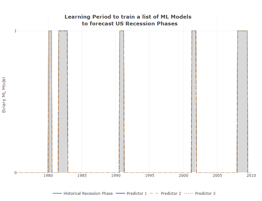
Verification of the model quality during the training phase
If we now apply the top 3 ML models to our test set with data points unknown to the model from 2012-2022, we see that all 3 models detect and report the next recession in 2020 with a slight time lag.
Accuracy of the Top3 ML Models to Predict US Recession in Test Phase
We can now look at the ranking of all models trained in this process and see in the leaderboard that the Top3 performers according to the standard model performance metric are all from the GBM family. The GBM algorithms produce gradient boosted classification trees and gradient boosted regression trees, which is appropriate in our case of binary splitting.
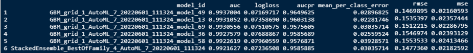
Training Results of Top Performing Algorithmns
A good list of the most important metrics for understanding model goodness of fit can be found on h2o. In our binary classification problem, H2O uses the model together with our dataset, besides other, to calculate the threshold that gives the maximum F1 value for our dataset.
3.3.2 See what drives the Models
It is interesting to see which underlying factors mostly dominate the algorithms. Logically, annualized GDP is the main driver of recession detection. However, it is interesting to note that model 2 and 3 also incorporate second-round factors such as Oil (energy) and Consumer Prices to a greater extent in their determination process. Interest rates and Production Costs are also important supporting factors.
# Get model ids for all models in the AutoML Leaderboard
aml <- autoML@leaderboard[,1]
model_ids <- as.data.frame(aml$model_id)[1:3,1]

# View variable importance for all the models (besides Stacked Ensemble)
for (model_id in model_ids) {
  print(model_id)
  m <- h2o::h2o.getModel(model_id)
  h2o::h2o.varimp(m)
  h2o::h2o.varimp_plot(m,num_of_features = 20)
}

# Check other main GDP Variable against Recession History
# Capture the time frame of historical recessions
plotly::plot_ly(x = ~date, y = ~price) %>%
  plotly::add_lines(data = eco_data %>% dplyr::filter(symbol != "USREC"),
                    color = ~symbol, line = list(width = 3),
                    hoverinfo = "x + y") %>%
  plotly::add_lines(data = eco_data %>% dplyr::filter(symbol == "USREC"),
                    line = list(width = 0),
                    fill = "tozerox",
                    fillcolor = "rgba(64, 64, 64, 0.2)",
                    showlegend = F,
                    hoverinfo = "none") %>%
  plotly::layout(title = list(text ="<b>Minor explanatory Indicators of the top 3 ML Models</b>",
                              y = 1.1),
                 xaxis = list(title =''),
                 yaxis = list(title = 'QoQ Variances',
                              range = c(-40, 40),
                              ticksuffix = "%"),
                 legend = list(orientation = "h",
                               xanchor = "center",
                               x = 0.5))
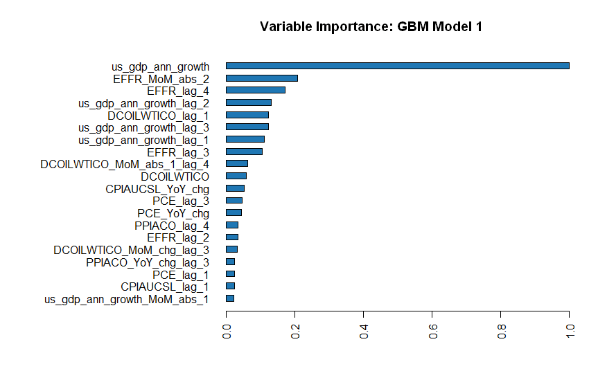
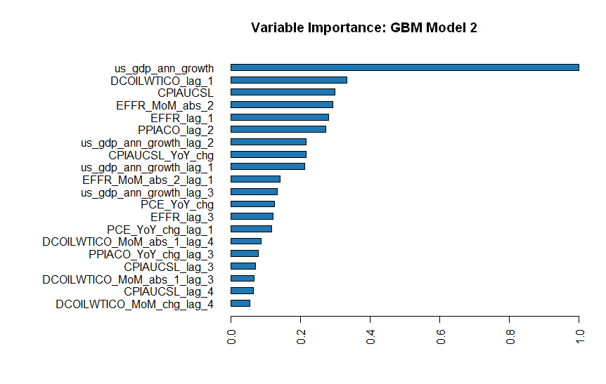
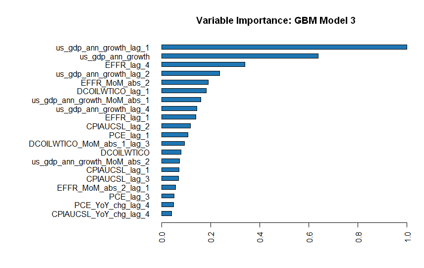
Figure 3.1: Main driving factors of Top3 Models
4 Forecast next Periods
4.1 Applying the Model to the Indicator Forecasts
For all our time series that we have used to train the ML algorithms, the financial market provides us with expectation curves for the next months and years. Therefore, we now want to apply our 3 best models to the market expectations and see if the current time series expectations include a recession possibility.
But before we apply the trained ML algorithms to our predicted time series, we also apply the arithmetic data point expansion from the training set in 3.2.
all_eco_fc <- DBI::dbGetQuery(mydb, "SELECT  meeting_date, `impl.rate`
                               FROM fin_data.eco_fed_funds_rate
                               WHERE retrieval_date LIKE '2022-04-01%'") %>%
  rbind(tibble::tibble(meeting_date = "2022-04-01",
                       impl.rate = 0.34)) %>% # effr was 0.34 as of the 1st of April
  dplyr::as_tibble() %>%
  dplyr::mutate(meeting_date = lubridate::as_date(meeting_date),
                term = as.numeric((meeting_date - min(meeting_date))/365)) %>%
  dplyr::rename(price = impl.rate) %>%
  dplyr::arrange(meeting_date)

DBI::dbDisconnect(mydb)


eco_fc <- suppressWarnings(all_eco_fc %>%
                    tidyr::pivot_wider(names_from = 'symbol',
                                       values_from = 'price') %>%
                    dplyr::arrange(date) %>% # as q,m,d frequency ts are included some columns include NA's
                    tidyr::fill(EFFR,DCOILWTICO, .direction = "updown") %>% # fill the daily gaps to avoid NAs at month's end
                    dplyr::filter(date == lubridate::floor_date(date, 'month')) %>%
                    dplyr::mutate(dplyr::across(.cols = c('PPIACO','CPIAUCSL'),
                                                .fns = ~(./dplyr::lag(.,n = 12)-1),
                                                .names = "{col}_YoY_chg"),
                                  # MoM % Change
                                  dplyr::across(.cols = c('us_gdp_ann_growth','EFFR','DCOILWTICO'),
                                                .fns = ~(. / dplyr::lag(.,n = 1)-1),
                                                .names = "{col}_MoM_chg"),
                                  # MoM abs Change
                                  dplyr::across(.cols = c('us_gdp_ann_growth','EFFR','DCOILWTICO'),
                                                .fns = list(~(.x - dplyr::lag(.,n = 1)),
                                                            ~(.x - dplyr::lag(.,n = 2))),
                                                .names = "{col}_MoM_abs_{fn}"),
                                  # 3mth cumsum
                                  dplyr::across(.cols = c('DCOILWTICO'),
                                                .fns = ~log(.x / dplyr::lag(.x,n = 2)),
                                                .names = "{col}_3m_chg"),
                                  # lag everything
                                  dplyr::across(.cols = is.numeric,
                                                .fns = list(~dplyr::lag(., n = 1),
                                                            ~dplyr::lag(., n = 2),
                                                            ~dplyr::lag(., n = 3)),
                                                .names = "{col}_lag_{fn}"))) %>%
                  dplyr::filter(date >= '2022-04-01') %>%
                  tidyr::drop_na()
# transform to h2o Object
h2_forecast <- h2o::as.h2o(eco_fc)
h2_forecast$usrec_mod1 <- h2o::h2o.predict(h2o::h2o.getModel(autoML@leaderboard[1,1]), h2_forecast)$predict
h2_forecast$usrec_mod2 <- h2o::h2o.predict(h2o::h2o.getModel(autoML@leaderboard[2,1]), h2_forecast)$predict
h2_forecast$usrec_mod3 <- h2o::h2o.predict(h2o::h2o.getModel(autoML@leaderboard[3,1]), h2_forecast)$predict
h2_forecast %>%
dplyr::as_tibble() %>%
dplyr::mutate(date = lubridate::as_date(date, tz = "UTC")) %>%
plotly::plot_ly() %>%
plotly::add_lines(x = ~date, y = ~us_gdp_ann_growth , name = "GDP growth forecast", line = list(shape = "spline", color = palette_main[1])) %>%
plotly::add_lines(x = ~date, y = ~usrec_mod1, name = "Predictor 1", line = list(color = palette_main[2])) %>%
plotly::add_lines(x = ~date, y = ~usrec_mod2, name = "Predictor 2", line = list(dash = "dash", color = palette_main[3])) %>%
plotly::add_lines(x = ~date, y = ~usrec_mod3, name = "Predictor 3", line = list(dash = "dot", color = palette_main[4])) %>%
plotly::layout(title = list(text ="<b>ML Forecasting Classifier of Recession \n <sup>as the Classification is binary it's 0 or 1</sup></b>",
y = 0.95),
xaxis = list(title =''),
yaxis = list(title = 'Forecasting US Recession over next 10 months \n vs US GDP Forecasting',
range = c(-1.7, 3)),
legend = list(orientation = "h",
xanchor = "center",
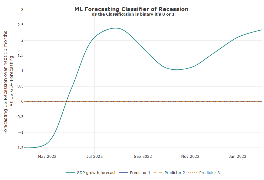
x = 0.5))Well, the result shows us flat lines for all 3 models. Meaning, there is a higher probability that there will be no recession in the next 10 months. (According to our first round of data and models!!)
In addition to the model forecast, we include into the chart the currently expected GDP curve. This shows a clear cooling of the U.S. economy in late 2022, but the algorithms do not estimate this to be serious enough to lead to a recession (for now):
Training Results of Top Performing Algorithmns
5 Conclusion
Recession is typically preceded by stagnation, in which capacities are no longer fully utilized and employment declines. Due to current global supply chain bottlenecks and high inflation, Central Banks attempt to reduce demand to match supply by adjusting their policy interest rates. Yet, as the second important factor, employment, seems to remain stable for the moment, stagnation seems to hold off. However, the news situation is outweighed by concerns about the future, progress and growth.
In our model, we see that the main driver is GDP growth and its forecast for the next month is quite mixed. Therefore, the next step could actually be to create a predictor of GDP growth with its own underlying driver. In the second round, factors such as the unemployment rate, PMI for manufacturers and services, inflation and wage growth will be very helpful.
FINALLY, this elaboration is a quite simple one and actually shows the process flow. You can use this as a template to structure your own forecast and apply your datasets. With each run, you can fine-tune your settings slightly.
Nevertheless, we hope that our elaboration will help you on and that you will provide us a short feedback at info@aikia.org!