1 Analyze critical dynamics in Financial Structures
Due to the very volatile developments and divergences of various market indices in recent days, we have extended the Dashboard App with the functionality of “Index Entropy”.
This allows us a timely identification of changing opportunities and risks in the investment environment, which we will briefly describe below. For the calculation of the Entropy ratio and its informative value we mainly use:
tidyquantfor open source data retrievalshinyfor the UIDBIfor writing to and querying our databasedplyrstringrandlubridateas utilitiesplotlyfor interactive visualization
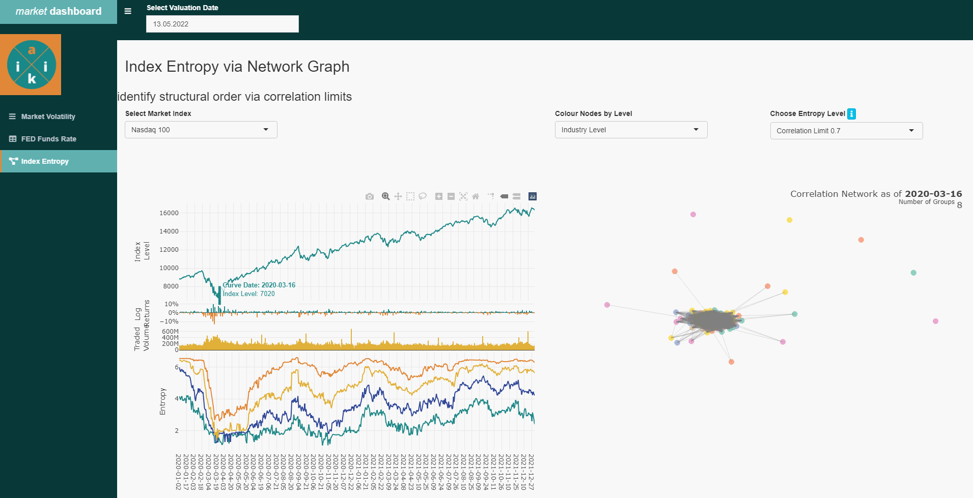
The result is a daily updated, interactive overview in the app , about the correlation behavior of the individual stocks in different selectable main financial indices. Here, outliers are identified, which resist the broader market trend. For example, at the beginning of the corona crisis, the later well-known “corona winners” MRNA, Ebay, Peleton, Zoom and GLD became visible quite at the beginning.
corona event in the beginning of 2020 with the emerging ‘corona winners’
1.1 Data Processing and Supply
In order to detect the dynamics of the financial Index systems with its higher number of constituents (respectively: stocks), network science with entropy measurement is suitable for us to set up the analysis to obtain the desired behavioral information. To detect the pattern of multiple interactions between stocks at a given time, we first need to create 2 successive batch processes:
At first, we will load open source based index and stock prices in a night batch. An associated ETL process (“Extract, Transform, Load”), as we use it here, has been described in more detail in the previous post ( fed funds rate plot ). Since the uploading to the database is dependent on the particular setup, we just show the core chunk of the data retrieval via the tidyquant package:
for(i in 1:nrow(list_of_ticker)){
new_data <- suppressWarnings(tidyquant::tq_get(list_of_ticker$ticker_id[i],
                                 "stock.prices",
                                 from = list_of_ticker$ticker_last_import[i]+1,
                                 to = lubridate::today())) # sometimes the "to" value helps to catch all dates
}
Secondly, before setting up the entropy analysis we already calculate the entropy value for each of our index in a subsequent night batch and store the results in our database.
Since we are using the Threshold Networks approch, we do this to save the relative long calculation time of the respective matrix calculation for each individual index at any given time in the use of the app. Otherwise, the entire process chain would take up too much precessing time in the Dashboard App . By pre-calculating we can pull the results on the fly from the database and display them immediately.
idx_entropy <- function(current_idx, hist_length = 51, corr_th = 0.7, val_date = lubridate::today()-1){

  # get ticker from index
  current_tic <- idx_tic_relation %>% dplyr::filter(index == current_idx) %>%
    tidyr::drop_na(ticker) %>%
    dplyr::pull(ticker) %>%
    stringr::str_c(collapse = "','")


  # set valuation date
  val_date <- ifelse(is.null(val_date), bizdays::offset(lubridate::today(), -1, 'UnitedStates/NYSE'), val_date) %>%
                lubridate::as_date()
  end_date <- bizdays::offset(val_date, -hist_length, 'UnitedStates/NYSE')


  # get relevant ticker sensis
  cur_ticker_hist <- DBI::dbGetQuery(mydb,paste0("SELECT *
                                     FROM fin_ticker_sensi_history
                                     WHERE date <= '", val_date,"'
                                     AND date > '", end_date,"'
                                     AND ticker_yh IN ('", current_tic,"')")) %>%
    dplyr::mutate(date = lubridate::as_date(date)) %>%
    dplyr::arrange(date) %>%
    dplyr::as_tibble()


  # get correlation
  suppressWarnings(
  cor_matrix <- cur_ticker_hist %>%
      dplyr::distinct(ticker, date, .keep_all = TRUE) %>%
      dplyr::select(ticker, dtd_return) %>%
      tidyr::pivot_wider(names_from = ticker, values_from = dtd_return) %>% # values_fn = length
      tidyr::unnest(cols = dplyr::everything()) %>%
      cor()
  )


  #Create graph for Louvain
  g  <- igraph::graph.adjacency(abs(cor_matrix) > as.numeric(corr_th), mode = "upper", weighted=TRUE, diag = FALSE)
  #df <- igraph::get.data.frame(g)

  #Louvain Comunity Detection
  cluster <- igraph::cluster_louvain(g)

  count_norm <- purrr::map_dbl(1:length(cluster), group_len_fun, graph_cluster = cluster)

  entropy <- sum(-(count_norm * log2(count_norm)))

  returndf <- tibble::tibble(
                date = val_date,
                indices = current_idx,
                ticker_yh = cluster$names,
                membership = cluster$membership,
                entropy = entropy,
                threshold = corr_th)

  DBI::dbWriteTable(mydb,
                    name = "fin_index_entropy_history",
                    value = returndf,
                    row.names = FALSE,
                    append = TRUE)

  return()
}
2 Correlation-based Networks
With the given data, we can start with the structure of an empirical correlation matrix at a given point in time which we construct by using the time series of the index constituents. After we have calculated the cross-correlations of the respective stocks we then use the threshold networks method for the network analysis. ALternative approaches to the threshold network method can be the Minimum Spanning Tree (MST) or the Planar Maximally Filtered Graph (PMFG) methods or similars.
In this approach, we use the graph.adjacency function from the igraph package, which creates an adjacency matrix. Here, we provide a threshold for the correlation that determines the connections of the network by filtering out the weak connections and keeping the strongest correlations. For a comparison, we use thresholds of 0.5, 0.6, 0.7, and 0.8. A small threshold results in a fully connected graph, while as the threshold increases the connections become fewer as it reduces the noise and reflects a correlation above chance at the time of creating the matrix. In a further step we can also determine the hierarchy of these stocks in the network structure and what impact they might have. Since the Pearson cross-correlation assumes that the time series are stationary, which is true for shorter time series, we use a Historical Length of 50 days for the cross correlation calculation.
Clearly, these links (correlation) between nodes (stocks) changes over time due to the fluctuations of the individual stock prices and it shows the underlying dynamics of the market. Visualization in Shiny can thus allow us a continuous monitoring to identify interesting patterns of trends, especially during critical events such as market collapses or market euphoria. Based on daily batch pre-processes just mentioned, the time series are updated and automatically provided on the Dashboard App . This allows us to monitor the correlation-based networks of each index as they evolve over time to provide important information about underlying market dynamics. Where relevant, we can also send out automated alerts in the event of unusually sharp co-efficient shifts or cluster formations.
3 Entropy
To continuously monitor the dynamic correlation structure of the financial market, we use the entropy measure. In different crisis periods, we can observe a significant information benefit if we consider that entropy measures the degree of heterogeneity of network nodes based on the assumption that connected nodes share more common properties than they do with unconnected nodes.
# Helper Function within "ENTROPY"
group_len_fun <- function(g, graph_cluster){
  group_length <- length(graph_cluster[[g]]) / graph_cluster$vcount
}

# Get Cluster lengths
count_norm <- purrr::map_dbl(1:length(cluster), group_len_fun, graph_cluster = cluster)

# Calculate Entropy
entropy <- sum(-(count_norm * log2(count_norm)))
Using the cluster_louvain function of the igraph package, we compute the Louvain community as independent subsets of the network. This function implements the multi-stage modularity optimization algorithm to determine the community structure in large networks and places each node in a particular cluster.
In times of increasing uncertainty in the financial markets, investors tend to be more risk averse and sell stocks with a higher probability of uncertain profits in the future. There is a stronger selection on individual stocks with more stable profit prospects. Thus, the clustering of all those stocks that are sold in uncertain times increases and only a few individual clusters of stocks remain that can resist the broad downward pressure.
This is shown by the entropy indicator that captures cluster formation over time and thus provides us a vivid trend indicator.
3.1 Making Index Entropy accessible
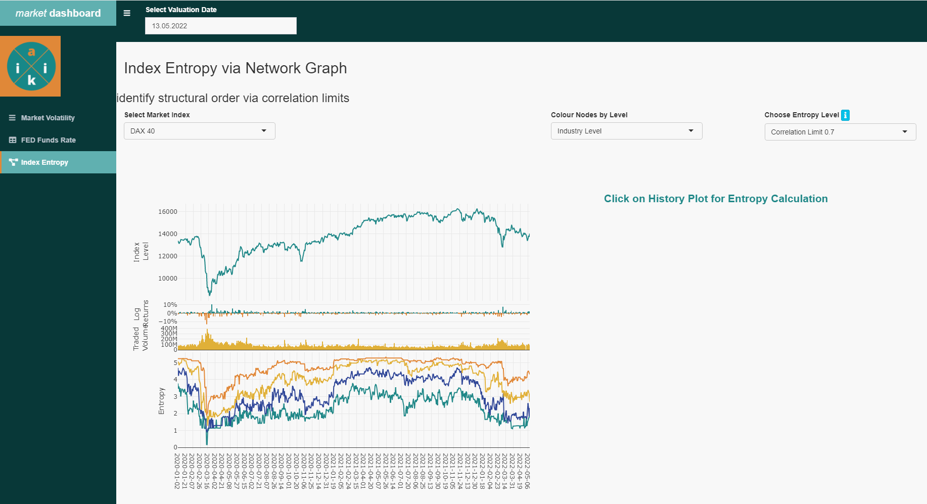
Finally, we implement an extra shiny page in the Dashboard App to visualize the histories.
In our ui.R file we first define the necessary plot areas where we want to output the graphs later on. Usually we use the plotly package for interactive plotting.
shinydashboard::tabItem(tabName = "idx_entro",
                                    h2("Index Entropy via Network Graph"),

                                        shiny::fluidRow(
                                          shiny::h3("identify structural order via correlation limits"),

                                          shiny::column(width = 6,
                                                        shiny::selectInput("choose_idx",
                                                                           label = "Select Market Index",
                                                                           choices = c("S&P 500" = "^GSPC",
                                                                                       "Nasdaq 100" = "^NDX",
                                                                                       "Euro Stoxx 50" = "^STOXX50E",
                                                                                       "DAX 40" = "^GDAXI",
                                                                                       "ASX" = "^AXJO"),
                                                                           selected = "^NDX")
                                          ),


                                        shiny::column(width = 3,
                                                      shiny::selectInput("choose_grouping", "Colour Nodes by Level",
                                                                         choices = c("Industry Level" = "Industry",
                                                                                     "Sector Level" = "Sector"),
                                                                         selected = "BIC_1")
                                        ),
                                        shiny::column(width = 3,
                                                      shiny::selectInput("choose_entropy_th",
                                                                         label = "Choose Entropy Level",
                                                                         choices = c("Correlation Limit 0.5" = 0.5,
                                                                                     "Correlation Limit 0.6" = 0.6,
                                                                                     "Correlation Limit 0.7" = 0.7,
                                                                                     "Correlation Limit 0.8" = 0.8),
                                                                         selected = 0.7)
                                        )


                                      ),
                                        br(), br(),br(), br(),

                                        shiny::column(width = 6,
                                          plotly::plotlyOutput("idx_entrop") %>%
                                            shinycssloaders::withSpinner()
                                        ),
                                        shiny::column(width = 6,
                                          plotly::plotlyOutput("date_entropy") %>%
                                            shinycssloaders::withSpinner()
                                        )

                  )
In the server.R file we again need reactive values that listen to variable changes from the UI and click events in the plot itself. The entropy_pnl_fun.R function then returns all the necessary data from the database to graphically display the corresponding index with its values.
  get_idx_entropy <- shiny::reactiveVal(NULL)

  # Reactive Value for Fed Funds Curve
  shiny::observe({
    entropy_pnl_plotly <- entropy_pnl_fun(input$val_date,
                                              input$choose_idx)
    plotly::event_register(entropy_pnl_plotly, "plotly_click")

    if(exists("click_data")){rm(click_data)}

    get_idx_entropy(entropy_pnl_plotly)
  })


  # Output for Index Timeline
  output$idx_entrop <- plotly::renderPlotly({
    get_idx_entropy()
  })


  # Output Correlation Network
  output$date_entropy <- plotly::renderPlotly({

    click_data <<- plotly::event_data("plotly_click") %>%
      dplyr::as_tibble()

    if(nrow(click_data) != 0){

      new_date <- click_data %>%
        dplyr::filter(y == click_data[["y"]]) %>%
        dplyr::pull(x)

      entrop_tic_group_fun(start_date = new_date,
                           cur_idx = input$choose_idx,
                           corr_th = input$choose_entropy_th,
                           sector_info = ticker_mapping,
                           grouping = input$choose_grouping)
    }
  })
As a result, the final output of the Index Entropy is produced, in which we can navigate through various functions.
history of Entropy values
Thus, we can display the corresponding correlation groups for each day (also historically), so that we get a quick overview of which stocks and areas of the index are resisting the general trend. This naturally leads to the question, what is different about these stocks?
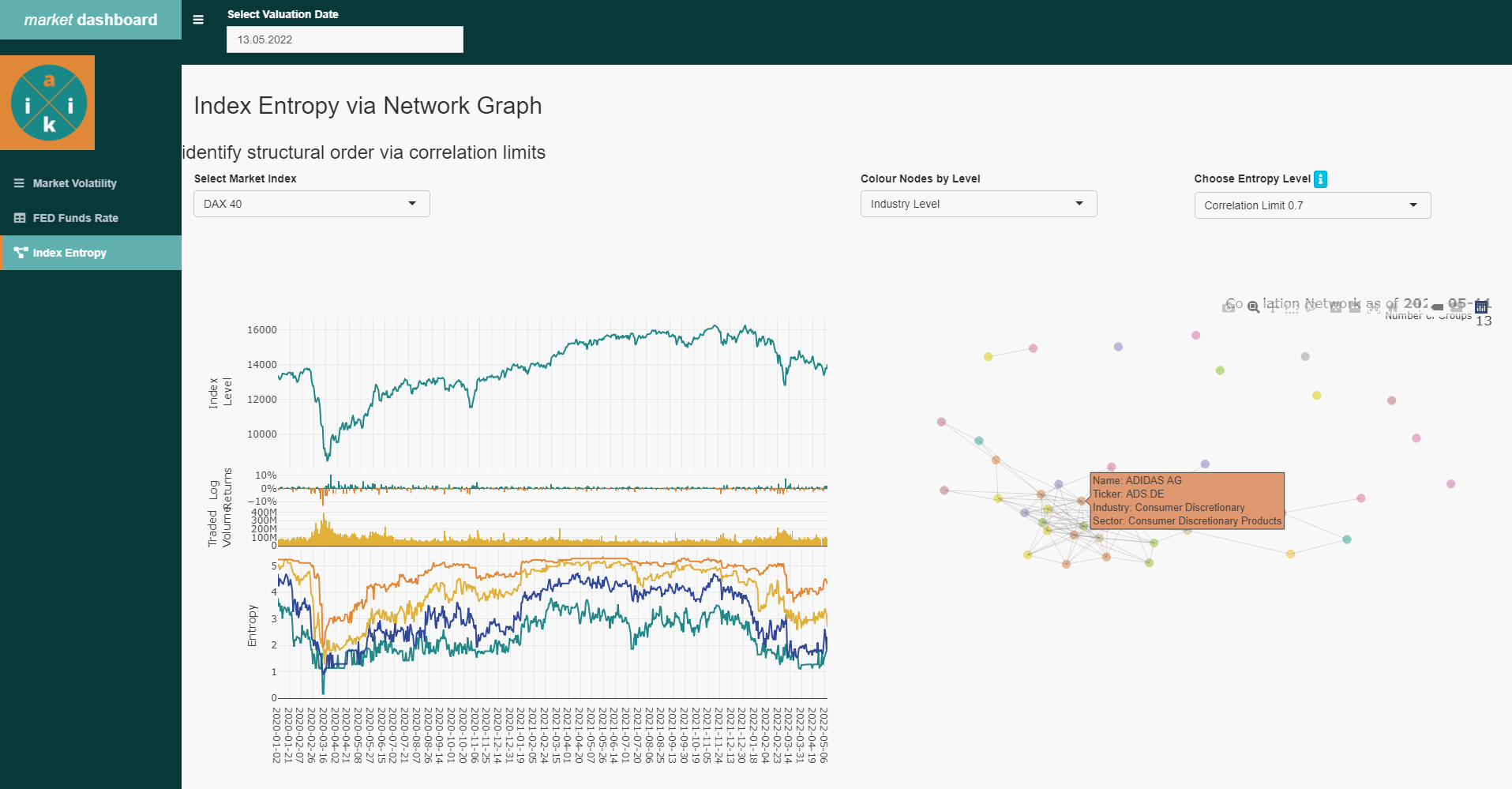
Entropy history with groups
4 Finally
Predicting structural changes in financial markets using traditional approaches and theories is a tricky task. however, these new alternative methods have the potential to continuously monitor and provide an intuitive way to understand the complex structures and dynamics of financial markets and may be used for timely intervention.
Of course, this procedure can also be applied to benchmarks and investment portfolios. We are happy to provide assistance with technical and structural implementation and welcome any feedback at reply@aikia.org.